Idea Behind These Paintings
I felt it would be wonderful to see all of the principal or cardinal kinds of color relationship in one room. I wondered if it would feel like looking through a prism, only more, like looking at three complete spectrums at once: the complete hue spectrum, the complete luminosity spectrum, and the complete intensity spectrum.
Furiously I started painting as many different kinds of color relationship as I could envision. After a few months, I realized that I had to set some kind of limit to the number of possible paintings, and that the limitation had to be systematic, so that the three spectrums would be evenly and completely represented. I eventually limited the number of color differences to three in each of the three aspects of color: minimal difference, maximal difference, and medial difference. Here's what I mean:
Minimal intensity difference means the two colors are the same intensity as far as possible: both colors either high, moderate, or low intensity. Maximal intensity difference means the most extreme possible difference, when one color is as high intensity as possible and the other as low intensity as possible. Medial intensity difference is when there is neither a complete intensity difference nor no difference, but a half-difference, for example: one color is of the highest intensity and the other of moderate intensity; or when one color is of moderate intensity and the other of lowest intensity.
And I limited luminosity differences to three: Minimal difference means the figure and ground look equally light, medium, or dark. Maximal difference means that one color is as light as possible and the other as dark as possible while still maintaining the necessary intensity requirement. Medial luminosity difference means that one color is light, the other medium; or one is medium, the other dark; or one is mid-way between light and medium, the other mid-way between medium and dark.
I also limited hue differences to three:
Maximal hue difference is when the hues of two colors are as different as possible and appear to stand apart sharply from one another, almost in opposition. When mixed together the two hues annihilate each other, or complete each other, so they are called complementary. Complementary lights ("positive colors") mix together to make white; complementary pigments ("negative" colors") mix together to make black or dark neutral gray as shown below:
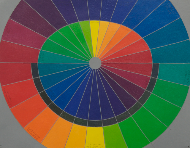
Complementary pairs of Hues and Mixtures of Each Pair
Minimal hue difference is when the hues of two colors are comfortably the same even though the other two aspects may be different, thereby distinguishing the two colors.
Medial hue difference is when the second hue is mid-way between one hue and its complementary hue. Medial hues neither oppose each other, nor are they as comfortable as monochromatic hues, but look well distinguished from one another and still harmoniously blending to give the impression of the hue between them.
These rather severe limitations still allowed 27 principal categories (3x3x3) with 2-16 principal variations in each category—giving more than 200 possible 2-color relationships, 181 of which I eventually painted.
The first 9 sets (categories) use only pairs of monochromatic hues (same or minimal hue difference), each pair of hues spread out evenly around the hue (or "chromatic") spectrum (or circle), but three different luminosity differences and three different intensity differences.
The last 9 sets have the same sequence of luminosity and intensity difference as the first 9 but with maximal hue difference: complementary hues.
The middle 9 sets have the same sequence of luminosity and intensity difference as the first 9 but with medial hue difference.
Choice of hues for each set doesn't matter if the relationship between figure and ground is correctly minimal, medial, or maximal hue-difference. Any hue can be chosen to show all these different color relationships. Even so, I wanted a full prismatic or hue range, so I tried to use as many different hues as is reasonable for variety: 9 evenly spaced 'primaries' and their complements. The primaries (in acrylic, mainly from Utrecht) are cadmium yellow light, cadmium orange, cadmium red medium, quinacra violet, dioxazine purple, cobalt blue, pthalo blue, pthalo green, and "green" (a mixture of cadmium yellow light and pthalo green). None of these 'primaries' are the exact complements of any of the others, but the complements of these 'primaries' are found by mixing the two primaries which are opposite each 'primary' in the right proportions so that mixture when mixed with its respective opposite primary produces black or neutral dark gray.
I knew that the painting sizes had to be small, so I chose 12"x12", but I didn't want Albers-like square figures on square grounds. I wanted something that you would want to look at longer, thereby giving your eye/brain more of a chance to absorb the feeling which is triggered by different proportions of color relationship. But what kind of shapes? Not abstract, not representational, not 'designed' (all of which trigger associations which usually seem to supplant direct impressions, but then what? I decided against the obvious choice: randomly determined shapes a la John Cage (even though I greatly admire his music). I decided to spackle on the paint with various palette knives, trowels, etc., and then sand down the paint so that it is perfectly flat, so that the colors reflect light evenly.
The resulting images are not representational any more than are clouds or Rorschach images. The palette knife gestures seemed to be affected by the colors and color relationships being used, but only through the way my arm and wrist felt, not by any mental associations with those colors or visual reactions during the process, as far as was possible for me, as far as I could forsee. I couldn't see what shapes would remain after sanding down each piece, though naturally a sense of what the feeling of each composition might become developed throughout production.
Each painting is acrylic on 3/8 inch birch plywood with 3/8 inch strips glued around the back edge for hanging.